Of late, I’ve had several of my fellow writers tell me my book covers don’t reflect the genre, or they need a bit of work, or that they could be better — more like the top selling indies in the genre.
All of that may be true and may be part of the reason I’m not rolling in the dough after 3 years of being an independent author-publisher.
So I’ve been having myself a major think. Significantly enough, the above comments came on the heels of my having listened to the two modules in Mark Dawson’s Self-Publishing Formula 101 course on covers and blurb writing.
Mark Dawson’s cover designer and artist, Stuart Bache, in the module on covers noted there are two different approaches to book covers: genre similar and genre standout. If you take a look on Amazon or even a walk through a bookstore, you’ll quickly see what is most popular. Genre similar. Why?
Because people are in a hurry, as the thinking goes, and what a genre similar cover does is tell the potential reader this is a sci-fi novel or a romance or a mystery or a thriller. Then other factors begin to influence. Title. Author name. Blurb.
However, if I’m specifically looking for a science fiction novel, a genre similar cover does nothing for me because I already know I’m looking for science fiction. I’m standing in the science fiction section of the bookstore. Or I searched for science fiction on Amazon. I think that is something that’s important to keep in mind.
Bryan Cohen, who presented the module on blurb writing, said that Mark Dawson’s own survey of his readers, asking what actually got them to buy the book, said it was the blurb — by a 5 to 1 margin — over the cover. Why? Because Dawson’s covers are all genre similar. There is nothing to distinguish his covers from any other author’s in the genre.
As a reader, not a writer, but as a reader, what do I look for when I’m looking to buy a book? Me. Not some survey, or industry standard. Me. What do I look for? After all, I’m the reader I know best.
I think that is an important question to ask. So I expanded my think to include the actions I went through to buy my last few books. And what I came up with for me is:
Unless the cover is truly a standout cover, it’s the title that draws my attention. Or the author’s name. When looking at the search results.
I haven’t been in a brick and mortar bookstore in quite awhile, so I limited myself to how I go about looking for a book on Amazon. This is the procedure I came up with for how I, a 64-year old guy, looks for a book to buy. Keep in mind younger men may do things differently, as most likely do women.
- I select the Kindle store.
- I key in the genre or sub-genre I want to read.
- I scan the search results.
- I pick a book.
- I read the blurb.
- I take a look at the reviews.
- If I’m still interested, I “Look Inside”.
- If still interested, I buy the book.
Those are the steps. Now let’s look at an example.
At step 2, I keyed in “private investigator mystery series”.
The results I got — minus cozies that got in there and box sets and sponsored ads — were the following in order on the first page:
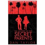 The Mystery of the Secret Parents – Dan Taylor
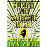 Murder with Sarcastic Intent – Dan Ames
 The Observer – T. Patrick Phelps
 Haggard Hawk – Douglas Watkinson
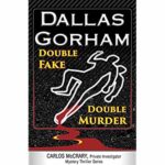 Double Fake, Double Murder – Dallas Gorham
After scanning the list, I ruled out Murder with Sarcastic Intent because the cover hurts my eyes, it’s that garish to me.
From the thumbnails, you can see genre similar prevails. What caught my eye was the first book: The Mystery of the Secret Parents. The cover is somewhat standout, the colors catching my eye. It doesn’t convey genre very well, but then I already know it’s a mystery because that is what I searched for. The title is a good mystery title. Not thrillerish. Just a good old-fashioned mystery.
So I clicked on the book and read the blurb, which was okay. So I looked at the reviews. There were some that threw up red flags for me, but I decided to “Look Inside”. Once I did, I said, Nope. Not for me. Back to step 3.
The only other book on the page of search results that caught my eye was Dallas Gorham’s Double Fake, Double Murder. The cover was a traditional murder mystery cover, which is what I like. The title conveyed the same idea, so I took a closer look.
The blurb didn’t particularly grab me. Too much selling in it. The reviews, though, were pretty good, so I took a “Look Inside”. Sad to say, I wasn’t impressed, and passed on the book.
Analyzing my process, I came to the conclusion that for me — genre similar covers without an eye-catching title — don’t pull me in from the search page. Notice, I passed on Dan Ames’s book with the genre similar cover and lackluster title. Which was the second book on the list.
What caught my eye, were the two covers that were somewhat different. With the title being the clincher.
If a standout cover and a snappy title are what catch my attention on the Amazon search page — where I’m already looking for a genre specific book — then why would I want to put boring genre similar covers on the books I write? I think the answer is obvious: I don’t.
To my mind where all of this genre appropriate cover advice goes south is that I’m not looking at a mix of genres and trying to find the genre I like. Which the cover would identify for me. I’ve already passed by that step by searching specifically for the genre I want to read. No one seems to have grasped that.
Now the danger in having too standout of a cover, is it can turn people off. As did Ames’s Murder with Sarcastic Intent.
Circling back around, as I’ve noted in previous posts, there is a lot of group think that goes on with people. There is a lot of thinking invading self-publishing that comes from traditional publishing. Which may be appropriate for the Big Corporate types, but not for us indies.
Even when I regularly visited bookstores and looked at books on a self, I went to the genres I wanted to read. And I passed by all the genre similar covers, unless they had a standout title, or a familiar author name, and picked up the book with the standout cover.
So are my covers hurting my sales? It’s possible. Or is some other factor at play here? Such as my doing virtually no advertising?
I’m inclined to think the virtually no advertising may be the actual culprit here, not the covers.
Of course the only way to know for sure is to do a test. Slap a few genre similar covers on my books, do nothing else, and see if I get better sales results. That test I’m considering. It might prove to be very interesting.
As always, your comments are very much welcome. If you’re inclined, take a look at my Amazon page and see if you think my covers are a problem. If you think they are, let me know. I genuinely want to know. But do look at them as I did above, in a long list of books in the same genre. Just so we keep things the same.
Until next time, happy reading!
Share This!





Covers… I remember, as a boy, asking my local bookstore to get me the UK version of a novel simply because the US import was terrible. In fact, that was usually the case.
Now, quite likely, it’s down to the fact that I’m British and so the UK cover designs appealed more to me. I think I did a comparison a few years ago (yes, I actually posted something on my blog) with US and UK covers. I’m not sure why it should be so, but the US covers were dreadful.
In my opinion, a cover is an extension of the book. It is one of the reasons I prefer print to digital. I want a good story and an interesting cover to display on my shelf or to ponder. I never think about genre when it comes to cover design. I go with the story. Always. The cover should reflect the story that the author is going to tell.
I do have books with boring run-of-the-mill designs. They are mostly fantasy novels from the 70’s-80’s. Some reflect the age and have grown on me over the years, others are just plain terrible (the Elric series to name one).
Colour can be important, but so too can elements such as space and placement. Font is also important for me. I’ve seen some good designs ruined by an overused or boring font (especially fantasy novels plastered with the Papyrus font).
Of those covers you’ve selected, the three that stand out for me are ‘…Secret Parents’, ‘Haggard Hawk’ and ‘Tackling Death’. However, I’m not a fan of having an author plastering their name in the boldest font that will fit on a cover. Maybe its just me, but the title of the book means more to me than the name of the author.
Will a good cover sell a book? No. However, it might make some readers stop and have a gander. After that, its the quality of your blurb/writing that will seal the deal.
Crispian! So good of you to stop by.
I couldn’t agree with you more: a cover is an extension of the book. Which means it will end up, in some way, reflecting the genre the book is in.
Good cover art is one of the reasons I also prefer print books. A good cover is a work of art and a lovely thing to behold. There are covers I’d love to frame. With digital books, it’s a bit more difficult to appreciate such art. Although there are a few covers I linger over when scanning my book apps simply because I find them so attractive.
And as you, for all of my book covers I didn’t think of genre — I thought of the story. And hopefully my covers in some way tell a bit of the story that’s contained within the covers.
But what my critics thought of in looking at my covers was genre. They however are writers and are simply following the standard advice: genre similar covers will sell your books. Which, I think, isn’t actually true. Good writing will sell your books in the end. Once, of course, you get discovered.
And it is getting discovered that is the issue. Which is why the mantra exists in the first place regarding ebook covers. However, a cover can do no more than stop the scanning eye. Once stopped, it’s the author’s story and the way in which he or she tells the story that will actually sell the book and the author to the reader.
Thanks again for stopping by. I look forward to your comments. They are always thought provoking. And the spam filter apparently especially likes this one. 😉
Nail on head… writers following the standard so that the Literary Inquisition doesn’t kick in their door and burn them at the stake.
A good cover is flypaper for readers.
Yes, indeed!
I think it has a lot to do with genre even if a person doesn’t go directly to the genre. A person who reads does tend to read within a similar genre and will be attracted to a similar genre styled cover.
The big problem as an indie reader is getting our covers to pop up on the page when someone is searching. Unfortunately, it is reviews and sells that make our books break through the algorithm. If you don’t have the sells and a certain number of reviews, your book won’t make it through the algorithm.
When I made it to my local library a lot, I would look at the new book display analyzing covers and what would attract me and what was trending. One thing, especially when it comes to thumb nail sized images, is color. When scanning through a group of book covers, color is one of the big things that will stop one’s eye from moving on. The three colors that stand out for people are red, blue and yellow/gold in jewel tones. Do we all have a bit of magpie in us?
Yes, I think book covers are important but not worth spending a bunch of money on. The title should be readable, the feeling of the cover should convey what the book is about, and the color should stand out without hurting one’s eyes 😉
There is a lot to be said for genre similar. For myself, I find them boring. Genre similar covers drive to me the title or blurb or comments. If I look at all.
Color, on the other hand, I agree, is a big attraction. Which baffles me why so many covers these days are dark. There is really very little that catches the eye. Red, though, is a problem as red color blindness affects a lot of people. It’s the most numerous form.
Covers are important. As Stuart Bache commented, a bad cover will sink a book. As will a totally inappropriate one. And I agree, I don’t think spending piles of money on a cover is worth it. TS Paul has a fat bank account using $50 generic covers. What sells his books is his storytelling. Sometimes I think we forget about that.
Hey there,
I understand your thinking, it is often frustrating to see so many similar covers adorning the shelves or filling our Amazon pages.
And you’re right (well, Bryan Cohen is right) there’s a lot of evidence which suggests people will decide to buy a book purely based on the blurb.
There are a few of points which I think are important:
1) A good cover designed within the genre look and feel will never do your novel any harm… a bad cover will.
2) Standout is important, but not for its own sake. An new indy author will need to put a lot more effort into selling something different.
3) Most people don’t buy books with a genre in mind, you might and many might, but the majority don’t know what they want to read when they’re shopping. In design, familiarity works across everything, from detergents to movie posters. It imparts something which can make the decision easier.
I’m more than happy to discuss this with you further.
Thanks for stopping by Stuart! I certainly agree with your first point. A bad cover is a bad cover. Although, like beauty, I suppose it is in the eye of the beholder. And I think your second point makes sense. Number three? I’d like to see some stats. After all, I can understand wandering around a bookstore. But do people actually wander around on Amazon? I never have. I go there with a purpose in mind.
And I do agree with the concept of familiarity in general. It’s that at home feeling. But that doesn’t necessarily get me to buy the product.
I just may take you up on your offer to discuss further. Education never hurts.
Thanks again for stopping by!
I’ve gotten cynical about this; for me, it’s the advertising. If you want to sell a million copies, throw a million dollars in advertising at it. With a $2.00 royalty, you’ll double your money. You just need a fortune to be doubled first!
You’re a man after my own heart, Jack! As long as the cover is not a total outlier for the genre, it’s all about the money thrown into the ad man’s coffers. Too many indies – with money – have shown that to be true.
Didn’t get around to your covers this time but “Murder with Sarcastic Intent” super jumped out at me. The color, the focus of the lines.
Thanks for stopping by, Andrew! Yes, it does do that! For me, the cover is simply too intense. But it definitely catches the eye!
Thanks, Andrew!